The album takes a very vintage style approach as it fits in with his music greatly. The black and white gives it a vintage look as well as the simple pictures of just the artist. The scenery is in the back streets of London. This could be used to in a way show his style of music as he has not decorated/edited his surroundings which shows the simplicity of his music. The title/name of the artist is very bold and uses simple font, because of the bold writing the name sticks out a lot so the viewer instantly knows who the artist is. The songs on the back of the album even though they are very small they are white and stick out quite a lot from the back ground of the picture.

The front cover of the album/main image is a simple image of the band showing. This could be used for effect to show that Arctic Monkeys are a very laid back band and are using their album cover to portray what type of band they are. The bands name is not large or very bold but is just placed on a person on the cover, this could be used to show that the band are very well known and most people will know who they are without being told. The lead singer is often seen as the most important then leading them to be the most famous, the fact that the lead singer is sat on the floor and is not the main/most prominent person on the image shows the band do not place importance on one artist and that they are all as important as each other. The font of the writing of 'arctic monkeys'.

Jamie T Album:
The album cover has a lot going on which could relate to Jamie T's type of music he sings very unusual and unorthodox music hence why the album cover is very unusual and different. The name of the artist and the album name is not very big and doesn't stand out very much. This could be because the artist is trying to emphasise that the picture is the most important bit of the album cover. The records covers scattered around the room gives the reader a feeling about what type of music the album will be like as it is clear the records are meant to be music that Jamie T listens to. This is effective as if someone see's a band/record they like or listen to,it makes them think they would like his music too. The repetition of 'panic prevention' is used to get the name of the album in your head as you can see it more than once.

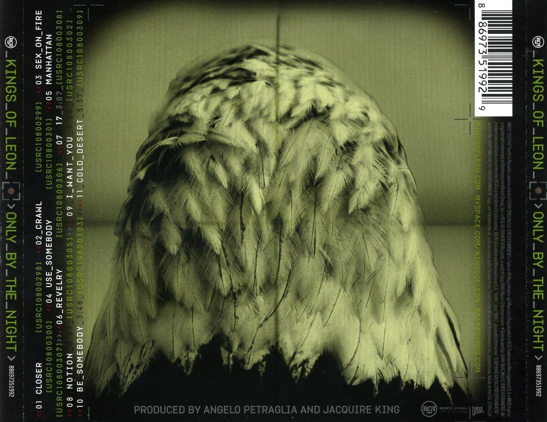
Kings Of Leon Album:
The front cover of the Kings Of Leon album 'only by the night' is very unusual which also makes it very effective as the general image is eye catching. The fact that the image is very eye catching means if people see the cover in the shops or even online they'll want to know more about the album as it so intriguing. The image shows parts of all the band photoshopped into an image of an eagle. This is shows that it is saying the whole band are equal and all of them are on the front cover because of this (as a lot of bands have just the lead singer/singers on the album cover). The colour of the image has been edited to a dark green colour which gives it a almost kind of scary or spooky aspect to it. Even though the name of the band and album are only small + in the top corners of the album they stand out greatly by using a very light/vibrant green. This make the names stand out with out taking away from the main image as they don't cover any of the person in the image. In the corner there is a red record sign which are often found on household, everyday cameras.


No comments:
Post a Comment